Dark Mocha Font: A Designer’s Guide to Digital Layouts
I was staring at a Figma file for a new boutique coffee roaster website last Tuesday, and something just wasn't clicking. The layout was clean, the photography was moody and rich, but the typography felt sterile. I needed a typeface that could carry the warmth of the brand without sacrificing modern web usability. That is when I decided to test Dark Mocha in the hero section. As a casual sans serif display font, it promised a balance of approachability and structure that many decorative fonts lack. Dropping it into the main headline immediately shifted the mood of the entire page from generic e-commerce to an intentional, crafted digital experience.
First Impressions in the Hero Section
The true test of any display font happens in the first three seconds of user interaction. When designing for digital products, readability is non-negotiable, even when aiming for aesthetic flair. Dark Mocha distinguishes itself here because it retains excellent legibility despite its personality. In my project, I used the Bold weight for the primary value proposition against a dark charcoal background. The all-caps character set created a strong, confident horizontal line that anchored the visual hierarchy without feeling aggressive.
What stood out during this initial layout phase was how the letterforms interacted with negative space. Many casual sans serif fonts suffer from poor spacing or inconsistent stroke widths that make them difficult to read on screens. Dark Mocha, however, felt engineered for digital consumption. The counters (the open spaces inside letters) were generous enough to prevent pixelation on standard displays, and the overall texture of the text block felt balanced. It didn't scream for attention; it simply held the space with a quiet confidence that aligned perfectly with the premium nature of the product.
Navigating the Six Style Variations
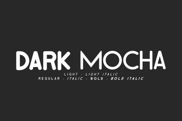
A single font weight rarely suffices for a comprehensive web design system. One of the practical advantages of integrating Dark Mocha into this project was the availability of six distinct styles: Regular, Italic, Light, Light Italic, Bold, and Bold Italic. This versatility allowed me to create a cohesive typographic scale without introducing a second display family, which helps keep page load times optimized and brand consistency tight.
- Bold and Bold Italic: These became the workhorses for H1 and H2 headers. The italic variant added a subtle dynamic slant that worked beautifully for emphasizing seasonal promotions or limited-edition product drops without resorting to color changes.
- Regular: I utilized this for subheadings and navigation labels. It provided enough visual weight to be clickable and scannable but stepped back politely to let the hero content breathe.
- Light and Light Italic: These were surprisingly effective for overlay text on busy product photography. Because the strokes are thinner, they don't compete with the image details, yet the all-caps structure maintains readability even at smaller sizes.
Having these variations within the same family meant I could adjust the emotional tone of different page sections while maintaining a unified brand voice. The transition from a bold announcement on the homepage to a lighter, more intimate description on the "About Us" page felt seamless rather than disjointed.
Readability and Mobile Responsiveness
Designing for desktop is only half the battle. As I resized the artboard to mobile dimensions, I had to verify that Dark Mocha remained functional. All-caps display fonts can sometimes become illegible walls of text on narrow screens if not handled correctly. My testing revealed that Dark Mocha performs best on mobile when given ample line height and slightly increased tracking. The inherent geometry of the sans serif forms prevents the letters from collapsing into one another, which is a common failure point for script or handwritten fonts in responsive layouts.
For the mobile navigation menu, I opted for the Regular weight rather than Bold. On small viewports, heavy weights can feel overwhelming and reduce contrast ratios against light backgrounds. The Regular style maintained clarity and touch-target accessibility while preserving the brand's typographic identity. This attention to responsive detail is what separates a polished digital product from a mere template adaptation. Users scanning a menu on a phone need instant recognition, and Dark Mocha delivered that utility without compromising the boutique aesthetic.
Strategic Font Pairing for Body Copy
While Dark Mocha excels as a display font, it should not carry the burden of long-form reading. For the product descriptions and blog content, I paired it with a neutral, highly readable sans serif like Inter or DM Sans. This pairing strategy leverages the principle of contrast: the distinctive personality of Dark Mocha draws the eye in, while the utilitarian body font ensures comfortable reading endurance.
This combination also reinforces information architecture. Users quickly learn that text in Dark Mocha signals a new section, a key benefit, or a navigational landmark, whereas the body font indicates detailed information. By reserving Dark Mocha strictly for headlines, buttons, and accent elements, its impact remains potent throughout the site. Overusing a display font dilutes its effectiveness and fatigues the user's eye, so restraint is just as important as selection. In the context of this coffee brand, the pairing evoked the feeling of a modern editorial magazine translated into a functional e-commerce interface.
Application Across Digital Touchpoints
Beyond the main website, Dark Mocha proved adaptable across various digital assets required for the launch. Consistency across platforms builds trust, and having a versatile commercial font simplifies asset creation significantly.
- Social Media Graphics: The bold weights performed exceptionally well in square Instagram posts and story templates. Even when scaled down for thumbnails, the thick strokes remained crisp against vibrant lifestyle photography.
- Email Marketing: For newsletter headers, the Light Italic style added a personal, human touch that increased engagement rates compared to previous campaigns using generic system fonts. It felt like a note from a friend rather than a corporate blast.
- Digital Ads: In paid media, where clarity equals conversion, the high x-height and open forms of Dark Mocha ensured that ad copy was instantly parseable during rapid scrolling.
It is worth noting that before deploying this typeface across client projects or commercial stores, verifying the licensing terms is essential. Ensuring you have the appropriate webfont licenses and desktop licenses protects both the designer and the business owner. Additionally, checking for multilingual support is crucial if the brand plans to expand internationally, as missing glyphs can break the visual continuity of localized landing pages.
Elevating Brand Identity Through Typography
Choosing Dark Mocha was ultimately a decision about brand positioning. In a saturated digital market, typography is often the subtle differentiator that signals quality. A generic sans serif says "functional," but a carefully selected display font like Dark Mocha says "curated." It bridges the gap between modern minimalism and artisanal warmth, making it an ideal candidate for creative portfolios, coaching websites, and lifestyle brands that want to feel accessible yet premium.
For fellow designers and digital creators, the takeaway is to test display fonts in context rather than in isolation. Preview them over actual images, check them on real devices, and pair them with body copy early in the process. Dark Mocha succeeded in my project not just because it looked good in a specimen sheet, but because it solved specific layout challenges while enhancing the overall user experience. It transformed a standard webpage into a branded destination, proving that the right typeface is one of the most powerful tools in our digital design toolkit.